In Part 4 of my series on Timeseries databases I have shown how to read the time series data with R. You have seen how to create choropleth maps using open data Shapefiles.
Now choropleth maps are an excellent tool to show changes over space, but we are not able to visualize subtle changes in distributions over time. So while I was browsing for interesting ways to visualize time series data I found Ridgeline plots.
According to the ggridges documentation;
Ridgeline plots are partially overlapping line plots that create the impression of a mountain range. They can be quite useful for visualizing changes in distributions over time or space.
R provides a great package ggridges written by Claus Wilke.
The Plan
In Part 1 of the series I have shown how to parse weather data for Germany provided by the Deutscher Wetterdienst (DWD).
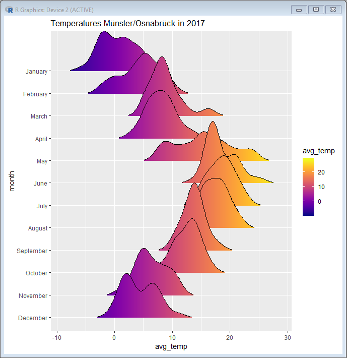
In this post I want to use Postgres with TimescaleDB to efficiently query and aggregate the DWD weather data. Then I will use the ggridges library to display the temperature distribution in 2017 of a weather station.
The DWD Dataset
The DWD Open Data portal of the Deutscher Wetterdienst (DWD) gives access to the historical weather data in Germany.
I decided to use all available historical air temperature data for Germany given in a 10 minute resolution (FTP Link).
SQL Query
It starts with getting the data from Postgres. For R scripts I always put SQL queries in a separate file to keep the R script clean from SQL statements. The query groups the weather data by station, day, month and aggregates by air temperature.
RPostgres only allows binding positional parameters, so always make sure to pass the parameters in correct order:
SELECT s.identifier as "station", date_trunc('day', w.timestamp) "day",  date_part('month', w.timestamp) "month_idx", to_char(w.timestamp, 'Month') "month",  avg(w.air_temperature_at_2m) "avg_temp"
FROM sample.weather_data w
    INNER JOIN sample.station s ON w.station_identifier = s.identifier
WHERE s.identifier = $1 AND w.timestamp >= $2 AND w.timestamp < $3
GROUP BY 1, 2, 3, 4
ORDER BY 1, 2, 3
R Script
The R script uses the SQL Query to get the data and then preprocess the data, such as cleaning the data from SQL and reordering the factors. Then I am using the example plot from the ggridges documentation:
# Copyright (c) Philipp Wagner. All rights reserved.
# Licensed under the MIT license. See LICENSE file in the project root for full license information.

#install.packages("DBI")
#instal.packages("RPostgres")
#install.packages("ggplot2")
#install.packages("viridis")
#install.packages("readr")
#install.packages("ggridges")

library(DBI)
library(ggplot2)
library(viridis)
library(readr)
library(ggridges)

# Connect to the database:
connection <- dbConnect(RPostgres::Postgres(),
                 dbname = 'sampledb',
                 host = 'localhost', # i.e. 'ec2-54-83-201-96.compute-1.amazonaws.com'
                 port = 5432, # or any other port specified by your DBA
                 user = 'philipp',
                 password = 'test_pwd')

# Read the SQL Query from an external file. Keeps the Script clean:
query <- read_file("D:\\github\\GermanWeatherDataExample\\GermanWeatherData\\TimescaleDB\\R\\ggridges\\query.sql")

# Query the Database and bind the positional query parameters:
temperatures <- dbGetQuery(connection, query, param = list('01766', '2017-01-01', '2018-01-01'))

# As a good citizen close RPostgres connection:
dbDisconnect(connection)

# First we trim off any whitespaces added by RPostgres, and then turn the characters
# into Factors. The Factors will be unordered, so we order the factors by month. I am
# adjusting it to be reverse, so it looks good in ggridges:
temperatures$month <- trimws(temperatures$month)
temperatures$month <- as.factor(temperatures$month)
temperatures$month <- factor(temperatures$month, levels = c("December", "November", "October", "September", "August", "July", "June", "May", "April","March", "February", "January"))

# Create the ggridges plot. This uses the same approach like described in the ggridges
# documentation at: https://cran.r-project.org/web/packages/ggridges/vignettes/introduction.html.
#
# I have used Station 01766, which is Münster/Osnabrück, which I am hardcoding here:
ggplot(temperatures, aes(x = `avg_temp`, y = `month`, fill = ..x..)) +
  geom_density_ridges_gradient(scale = 3, rel_min_height = 0.01) +
  scale_fill_viridis(name = "avg_temp", option = "C") +
  labs(title = 'Temperatures Münster/Osnabrück in 2017')
Result
And the result shows the temperature distribution per months:
Conclusion
This was a short post again!
I hope this articles gives a good start for using ggridges to display time series data in Postgres.
